Agent IQ
Powering communication experience between customers & bankers

My story here
I am the only full-stack UX/UI designer & UX engineer here. I got the chance to revamp the whole banker-side web platform, design the customer-side application (web widget, mobile app) from scratch, keep designing new features and updating existing ones. And I collaborate with CXOs, PM, engineer team, and marketing team in fast iterations to make the magic release happen! :)
Focus areas
SaaS, Conversational experience design, Chatbot/AI, Data visualization design Team management design
My roles
UX/UI designer,
Interaction designer,
Website designer,
UX&UI engineer
Tools
Sketch,
HTML, CSS,
JavaScript,
Photoshop,
BRIEF
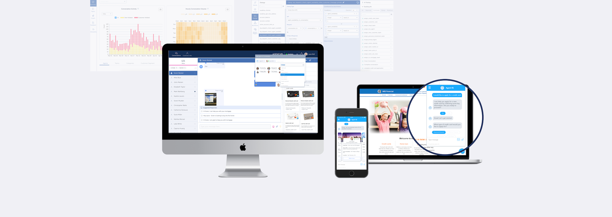
Unlike traditional customer service centers, which is time-consuming and not convenient enough, Agent IQ’s AI-boosted customer service platform, chat mobile application and web widget provide a frictionless digital communication experience between financial institutions and their customers, establishes deep relationships between customers and bankers, providing supportive tools and convenience to both sides.[1][2][3][4]
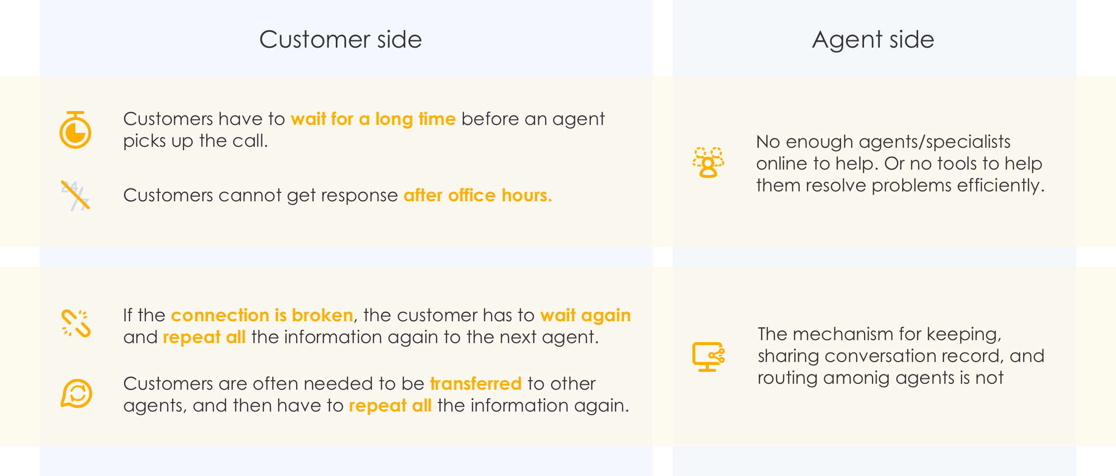
CHALLENGES - my understanding of traditional customer service centers
Let’s think about your own call center experience…
How much time and effort did you spend there?

How about for banking? If you lost your credit card, how nervous would you be while waiting in line over the phone or in a branch? If you have a complex investment or loan case, would you like to explain the situation to different bankers again and again?
The main problems become:
- How to help customers get timely help?
- How to improve the customer experience of this service procese (prevent any loss of context, get the answers they need frictionlessly)?
- How to improve the efficiency and experience on the bankers' side?
MY PROCESS
My process to generate a design solution usually involves: defining the problem area, narrowing down the scope to simplify it, conducting research to explore best practices and potential solutions, proposing design ideas based on the requirements from customers, company, tech limitation, then discussing and refining them considering the edge cases. Each of them may inspire new design ideas and also twist others. After a few fast discussions and iterations, present the final design solution to the team and deliver the handoff to the engineer team.

Limited information is shown here based on the Agent IQ official website. The related links of website pages are shown below.
DESIGN FOR CUSTOMER SIDE CHAT EXPERIENCE
SaaS | Conversational Experience Design | Chatbot/AI | Mobile
Problem Solving + Convenience = ?
For the area of banking customer service, "self-service”, “empower bankers”, “personalized experience" have become more and more popular.
Customers now have higher expectation, we translate these using questions:
- Can customers contact banks whenever/wherever they have an issue?
- How can customers find the right resource to solve problems?
- How can customers have a secure and stable connection with the bank, so no need to repeat themselves?
From researches and several discussions, we come up with the ideas below. And the metrics collected later also show us that these are successful. An mobile application and web widget were designed for customers.
Using a chat application, having the banker team and AI together can help customers to reach out to their bankers anytime anywhere[2][3].
Customers can have their own primary banker as the gateway to the right resources and experts[2].
Past conversation and context should always be available for review (in chat history) to reduce repetition[3].
Design for personal banker selection - first time experience
Questions I ask when design interaction:
When is the appropriate time for this action?
How does the user take the action?
What & how the information should be provided?
Scalability? How can the components be reused?
Common steps after a (financial related) mobile app launches for the first time:
A splash screen which allows the app to load; intro screens to show the users what to expect; T&C screens as the legal backbone; sign up/sign in screen (if needed); onboarding (if needed); main action UI; mobile notification and access permissions.
In our app, chat UI is the main interface. For when we should ask the customer to select a primary banker, there would be different options: from after login to whenever during their conversation.
After several discussions, we made the decision to put the banker selecting at the beginning of the chat, by considering how to naturally introduce this as a gateway to other resources[2], the fluency of experience, consistency and capability to reuse this flow in other use cases.
Common flow of first time launch for financial related mobile app
For how to ask customers to choose a banker, we decided to use AI to trigger the conversation. So the users can also start experiencing our AI by this chance. We try to provide a feeling that “welcome to choose a banker because it is beneficial”, but not “force it”. You can check the experience in the video.
Unlike transactional customer service which assigns a banker randomly, we allow customers to choose a suitable primary banker by showing bankers’ information in card format[2]. The layout and interaction of the card were also designed and updated gradually.
What’s more, to design this flow, not only the customer(mobile) side needs to be considered, I also designed the view and components in the banker side accordingly. You can check the banker selection experience in the demo video (first 20 seconds).
Design for AI - humanized? accuracy and fluency
A lot of research and design has been done when I designed for the chat experience with AI. Customers use human language to ask for help, using very different expressions, and the AI cannot understand questions as accurately as a human agent. Customers will lose patience easily if they cannot be understood.

Example: customer lost patience with AI
So the key is how to design to keep the conversation going on and let human bankers participate at the right time if needed. Design for chatting with AI includes a lot and also many edge cases to deal with.
One example is the message format design to show the messages. Based on my research, there are many different formats, such as free text messages, forms, buttons and so on. Some are more humanized, some are more accurate. So based on different use cases, we choose different methods. You can check the video to see some examples.
Design for experience & detail - Security and transparency
Security and transparency are very important for fintech applications. Not only for the technology aspect, also for the user experience of the customer side and banker side.
For example, since experts can be invited into the chat[2], the customers should be able to know whoever joins the conversation, who can access their messages, and feel safe about their information. Bankers should be able to know when other bankers join the conversation to avoid confusion.
You can check the experience in the demo video
Takeaways & Thoughts
AI is an interesting field to design and discover. Some people support hiding AI to improve efficiency, pretending that you are talking with a real person.
Some people agree with “never lie to your customers” to improve transparency. Many people still prefer to chat with a human agent directly, although the AI can help them.
I feel there may be no final answer for this debate, but we need to make our own decision according to context when designing.
While designing a mobile app, there are many more (edge) cases & details to consider.
e.g. The internet connection issue & different status, loading, Android special button, iPhone special gestures, biometrics, lock screen cases, responsiveness, scalability of showing more content, etc.
Bank Side Platform
SaaS Design | B2B | Conversational Experience Design | Table & Form Design | Data Visualization Design | Design System | AI
For the bankers
The challenge: how to empower the bankers to improve their efficiency and experience while helping the customers?
One common challenge that many customer service centers have is how to quickly access the materials from different resources/systems while helping customers.
So they can provide a timely reply.
Agent IQ’s smart platform can learn from the bankers' and customers’ actions over time then provide reasonable suggestions[5][4], which can help bankers to provide personalised and timely service[4].
I worked heavily on designing intuitive UIs which make the information easier to be accessed by bankers. The designs included
- designing the layout and interaction to make all customer information and attachment knowledgebase easier to access by bankers while chatting with customers;
- how to present the list of suggested replies generated from AI, and allows bankers to use and edit it easily and flexibly;
- How to use visual cues to show the more likely-useful files that are refined by AI, so bankers can access them conveniently.
Of course, designing a clear way to show different conversations’ status (e.g. Unread, waiting for reply, etc) and notification mechanisms are really important for bankers to take care of all the customers’ requests in time.
The flows of team collaboration (invite experts and conversation handoff) is also well designed.
All aim to help the bankers to focus on what is important[4] and improve efficiency and effectiveness. You can check the examples @ video below (after 00:20).

Example UIs for bankers and adimns[4]
For the Admins
Because they need to support and manage the other two sides, so I designed to help admins to review the metrics of bankers and customers behaviors,
manage and support bankers, and config the AI & platform in an intuitive and flexible way[4].
My visualization skills are heavily used here. Complex settings and huge amounts of data all need clear visualization design,
with flexible interactions (sorting, filtering, etc.).
Take Metics design as an example. It is not only about understanding what is important for the bankers and admins,
but also needs research on domain knowledge (KPI) and statistical knowledge, then choose appropriate charts, make reasonable design for interactions and visuals.
Examples can also be seen in the video below (after 02:00).
Takeaways & Thoughts
I feel lucky that I have the chance to design for a lot of different functions and items which are commonly used in service platforms.
I also realize that one super important experience is designing the Design System.
Especially if I need to add more and more new features to a complex system later. The way to layout items, the interaction, the style… all need to be consistent and scalable.
Otherwise it will be more and more difficult to add new features.
So when I start to design a component now, I always ask myself:
- Is there another existing one that can be used instead of creating a new one?
- If there is no existing component that can be used, can I use existing interactions, icons and standard colors in this new component?
- If designing a new one, how to make it reusable? How to make it scalable? Can it fit into the system?
References
[1] Agent IQ Home Page - https://agentiq.com/
[2] Agent IQ Overview - https://agentiq.com/overview.html
[3] Agent IQ Customers - https://agentiq.com/customers.html
[4] Agent IQ Bankers - https://agentiq.com/bankers.html
[5] Agent IQ AI - https://agentiq.com/ai.html