Product Management Table - Interaction & Visual Design
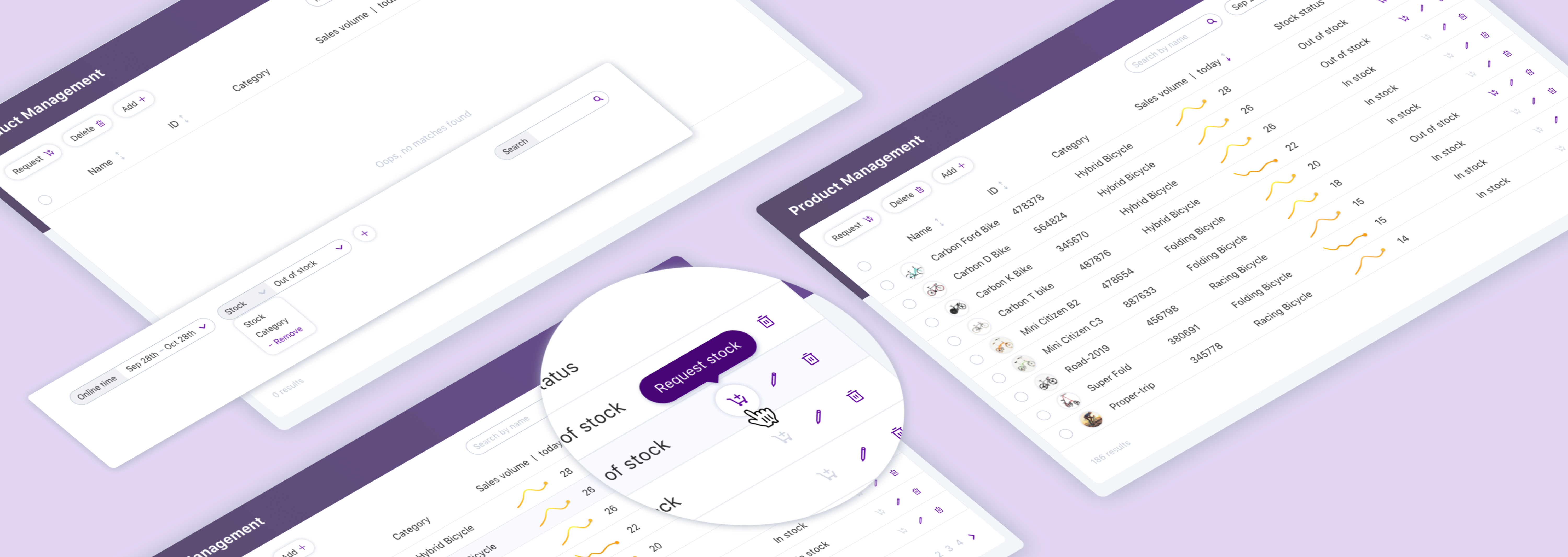
Focus areas
UX/UI design,
Interaction design
My roles
UX/UI designer,
Interaction designer
Tools
Sketch, Pencil & paper
BRIEF
Table is a powerful element that includes many detailed functions. It allows users to review and organize a large amount of data.
In this project, I made design of a product management table with several iterations to
- take care of all the detailed interactions,
- resolve the problem about how to design and embed the table into a long page to reduce the confusions of filter action flows from the initial design,
- provide a filter design which is scalable within limited space.
Hope the designs in this table can provide helpful ideas for designing other tables.
CHALLENGES
Designing the whole table with full functions and details is the first challenge. A lot of things need to consider, for example, the layout of the content and actions, sorting, searching and edge cases/ status.
The second challenge is how to embed the table into a long UI with convenient filter functions and reasonable interaction flow.
What's more, there is a need for designing a scalable filter group to fit in limited space.
METHOD & PROCESS
In this design, basic functions and components that are commonly used for the product management table were designed first according to the requirements. Then based on some users’ feedback, limitations of the whole UI and context, updates of the UI arrangement and interaction were also made.

BASIC REQUIREMENTS
- This table should show product(bike) data (name, ID, category, stock status, and recent sales trend(preferred), image) clearly for the manager to review and manage. - Content types: text, image, trend, status.
- The user should be able to sort, search, and filter based on the columns.
- The user should be able to edit, add or delete items.
- Request stock replenishment action is also needed. Bulk action and action on a should be supported.
Other items need to deal within the table:
- Pagination
- Search result indicator
DESIGN - the table
I split the requirements into content and interactions, and then designed the table layout based on this.

Requirements
Considering the flow of doing multi-selecting and bulk action, I selected to put the action buttons on the left (as shown in the right image), which is close to the checkboxes.

Table layout
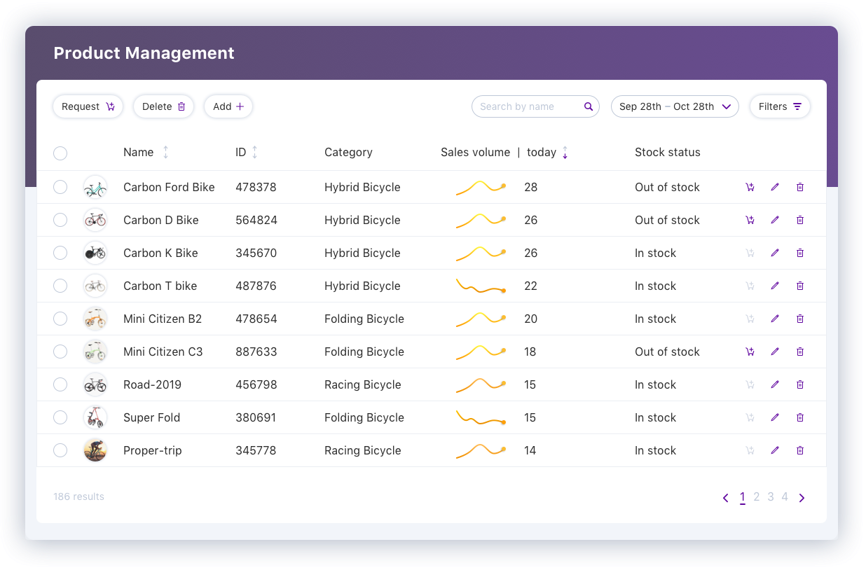
Then I made the hi-fi design of the table with some fake content to show the columns.
Interactions, different status, buttons, input field, dropdown, checkbox, tooltip, icons, pagination, text styles were designed in a consistent style.
Some of the designs are shown in the images below.
Details also had been taken care of. For example, use the icon both inside the table and on the button with text inside the toolbar. So users can tell the meaning of the icon inside the table easily.
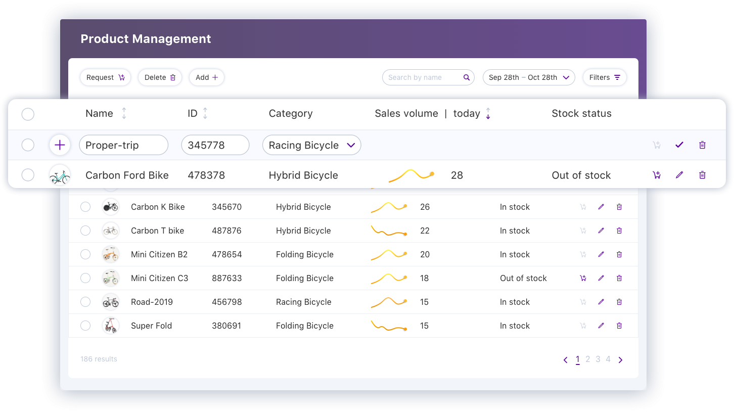
The product information, sales trends, stock status are shown in the table for the manager to review and organize.
The manager can sort or filter the table to get information accordingly.
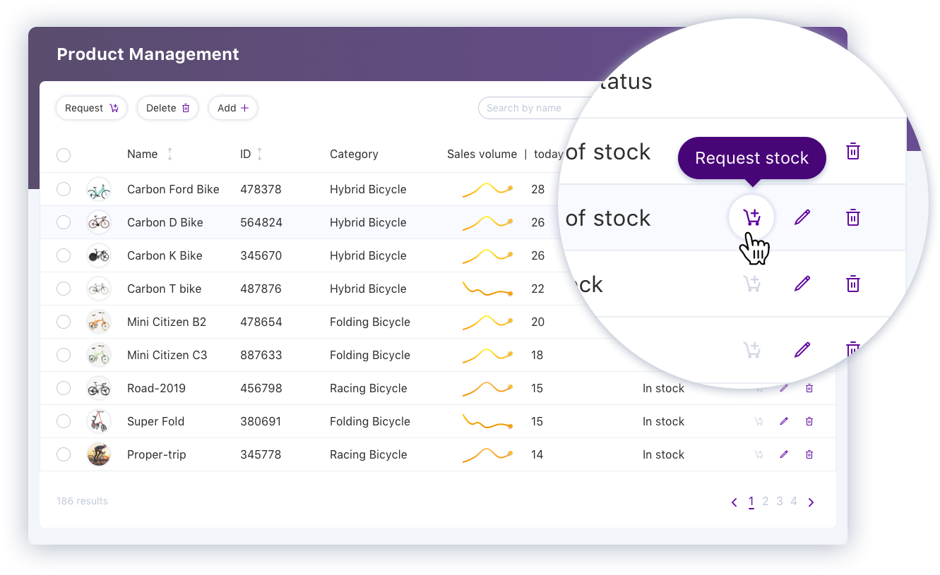
Want to take an action for one item?
Hover over the button, while it is highlighted, a tooltip is also shown to help avoid misunderstanding.
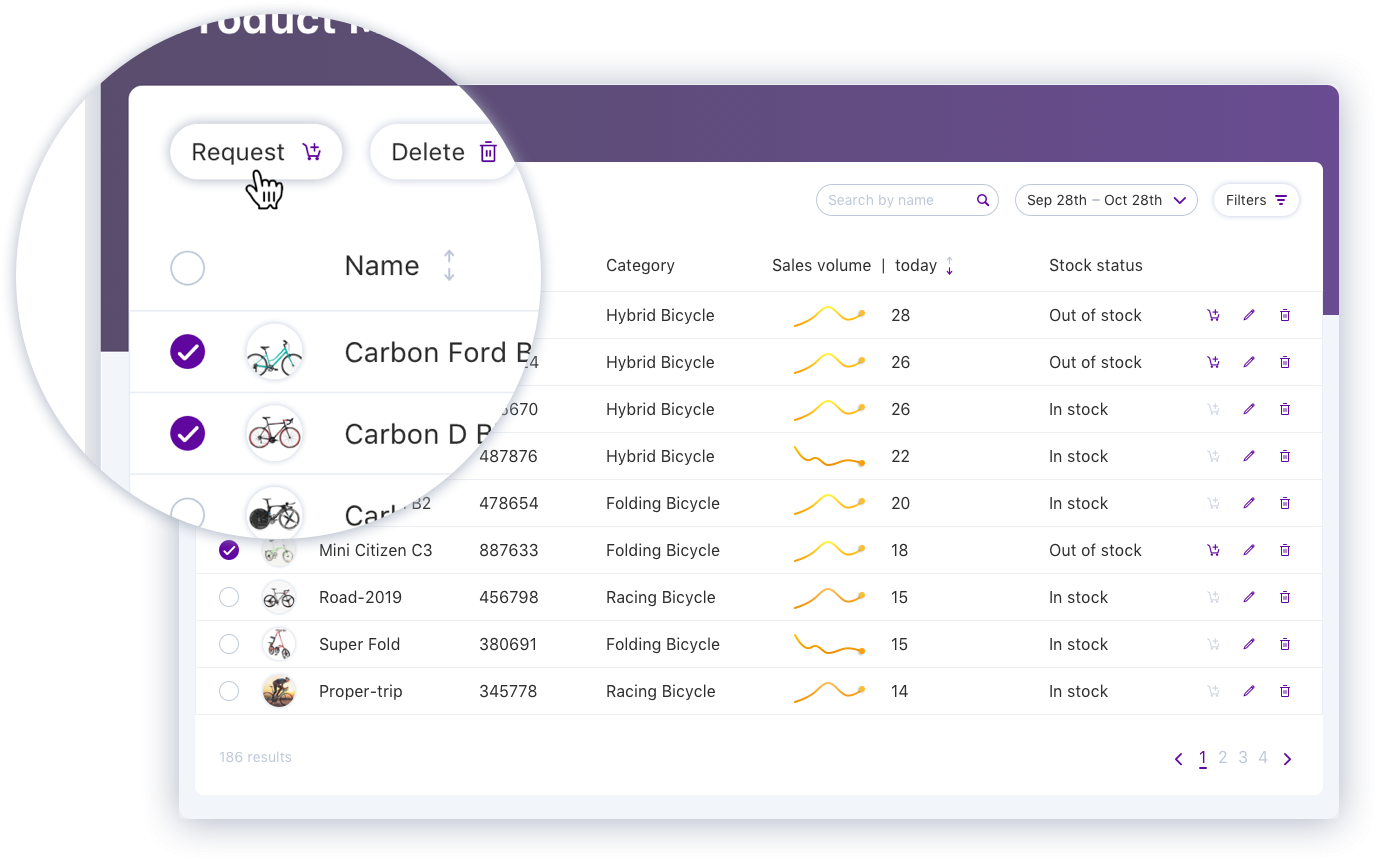
Want to take an action for multiple items?
For example, request stock replenishment for those ones with great sales trends but out of stock.
Check the checkboxes and click the button!
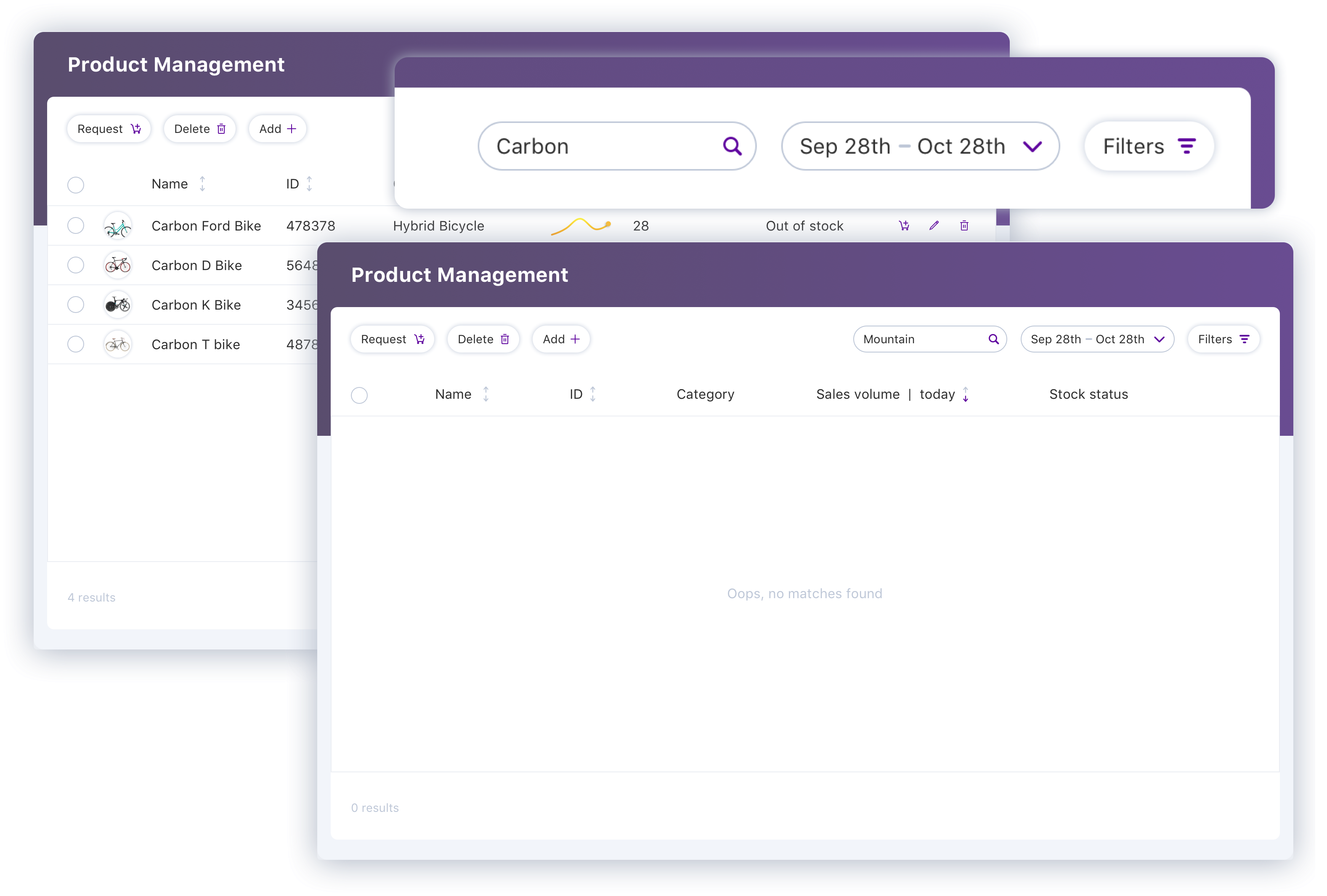
Search what you want and see how many items return.
Want to add a new product?
click the “Add+” button and type the information.
CHALLENGE WITHIN THE UI - bulk actions to filter the long page
Then there was a new requirement: use the multi-selection function in the table to update the overview information before the table in the same page.
The initial request was adding an update button in the button section.
Clicking the button after selecting items, it will update all the overview information and auto scroll up to the top.
So the users can see the updated information.
However, we got feedback that this function was not easy to understand and easy to be ignored.
What’s more, it was easy to get confused which filters were actually used since there were some basic filters on the top of the page.
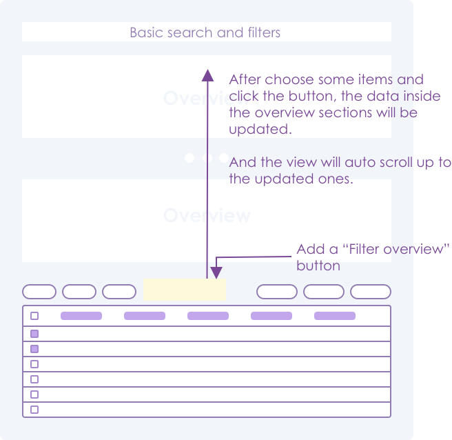
Initial request and the flow
Does the request = users need?
Then I thought about what’s the initial need of the request.
It was not about adding a button. It’s about how to adjust the overview information after the user sees the table.
I.e. a convenient way to adjust the filters although the user is looking at the end of a long page.
So I decided to decouple the filter function from the table. The filter group on the top should take charge of the whole function and always stay on the top of the view. So the users don’t need to remember what they need and scroll up to top to update the filters.
Because the users see that the filters are for the whole page from the beginning, when they change the filters as needed, they know the whole page is updated.

New solution: fixed filter location - at top of the page(left) & scroll to the bottom(right)
REDESIGN - the filters and action buttons
Filters
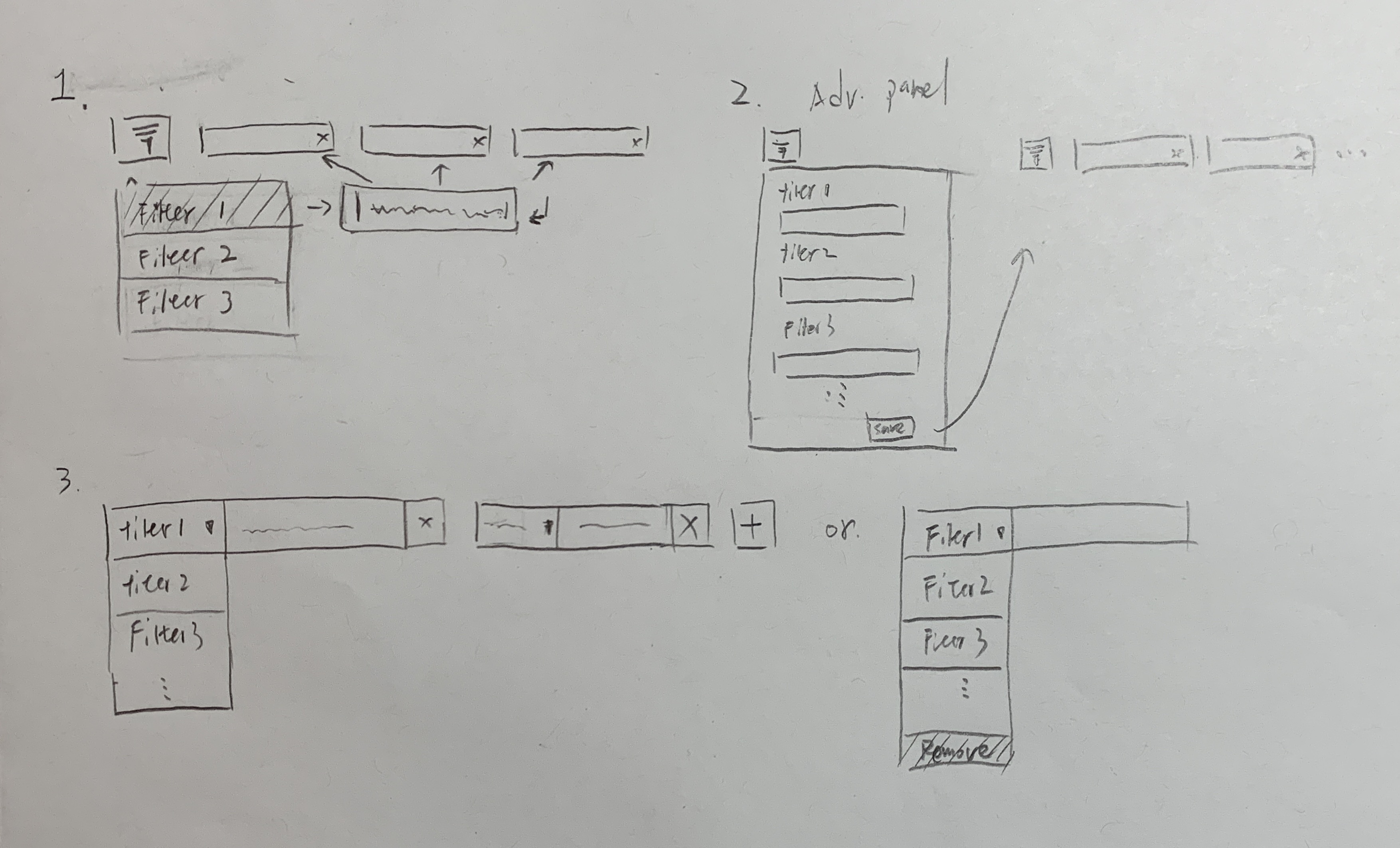
More filters need to be added to the table.
Considering the amount of filters and the limitation of the horizontal space, the filters were hidden inside a button in the previous design.
A redesign of the filter group was made which provides better flexibility and scalability. It is based on:
- There are more spaces to show more filters as the main functionality in the search & filter section. (Because of the change of the filter location for bulk actions).
- There was no clear information about which filters are more important and if any others will be added later.
I explored many different types of filters, which are summarized and compared below.
The default state with the name/placeholder and the filled state of different types were compared and discussed in detail.
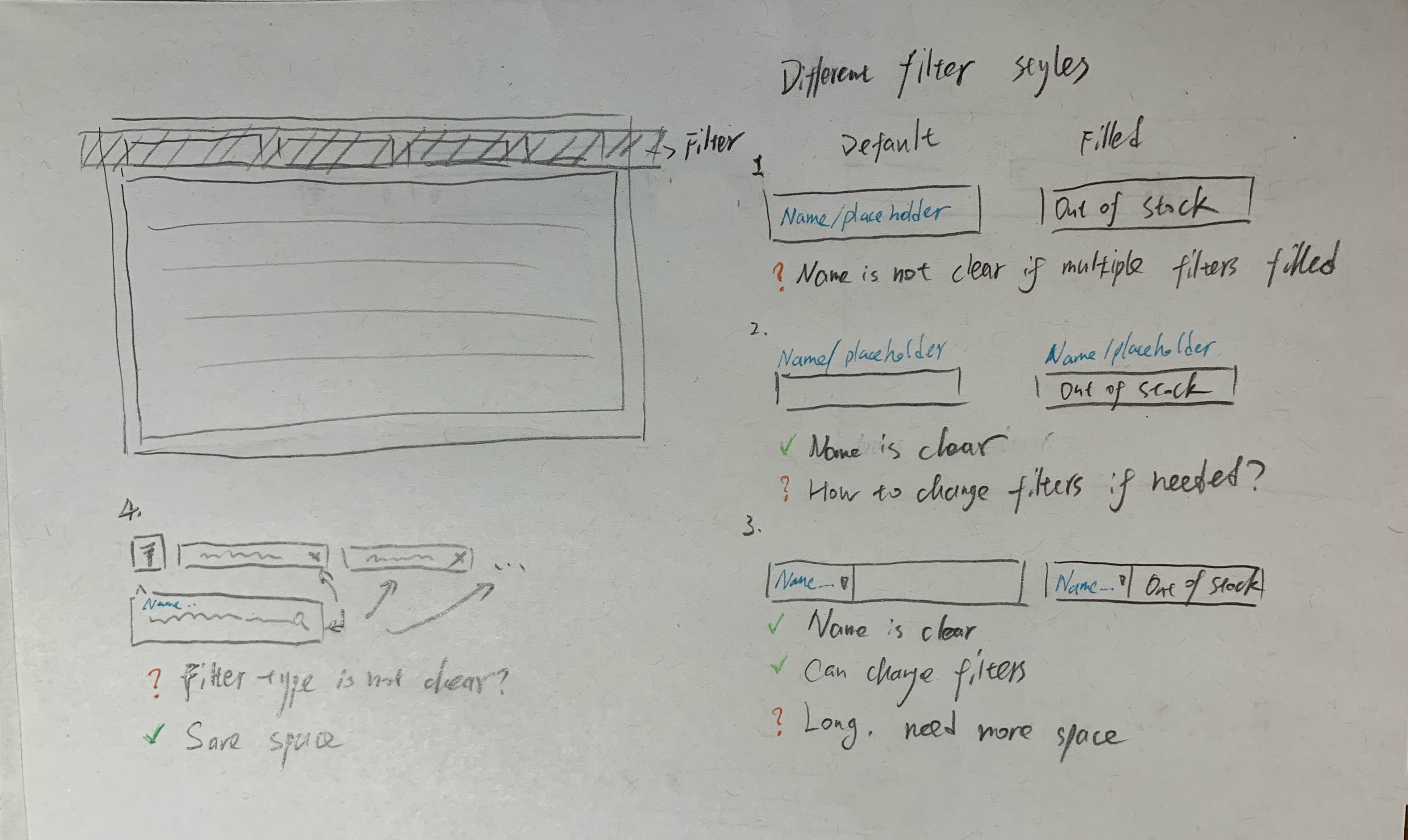
Type1 is clear as default. But based on some users’ feedback, after it is filled, the purpose of the filter is not clear.
Because the title is not visible anymore and only based on content, it is not always distinguishable.
Type2 has a persistent place for the filter name, but it is more complex if you need to change the filter later.
Type3 also has a persistent place for the filter name. The advantage is that we can add a dropdown to change the filter. But it takes more spaces than 1 and 2.
Type4 is a flexible way to add more filters. But it also has the issue that the types of the filters added are not clear.
All of these have their own pros and cons. Then I considered more other limitations to select from them.
- Not all the filters are needed all the time
- No enough space to put all the filters in the head area statically
- In different scenarios, the user may use different joint-filter combinations. So “add”, “delete”, “change” filters will be needed.
Based on the types discussed, I combined the 2,3,4, and made some changes. Three more detailed versions are shown below.
Because users want to have a clear view of selected filters, I chose V3 to further design. See the interaction below.

Action buttons
For the bulk action of many items, I considered moving the button shown after users select items. Because
- The buttons are useable only after checking several items
- The buttons are not useful for other overview sections in this case.
- The action buttons appear after the selection which can attract users’ attention, so they know what they could do next.
The final design can be seen below.
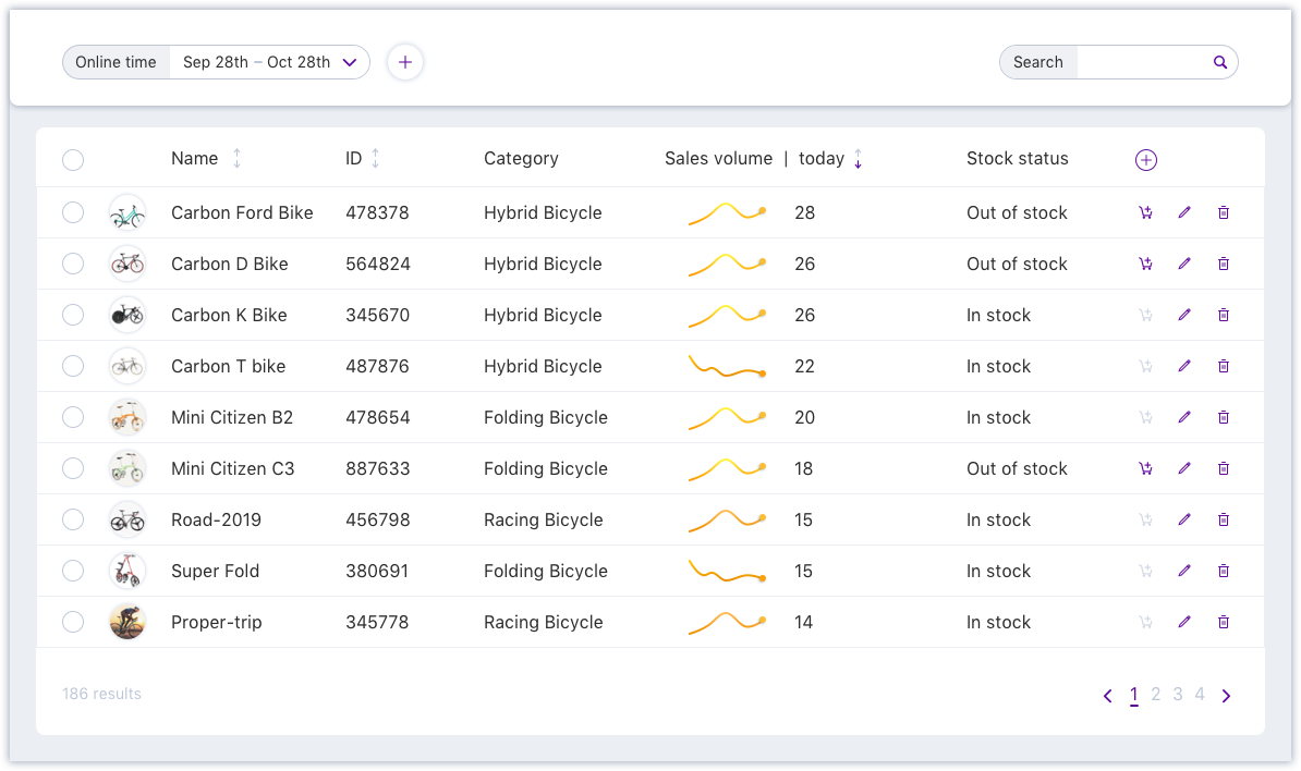
Default
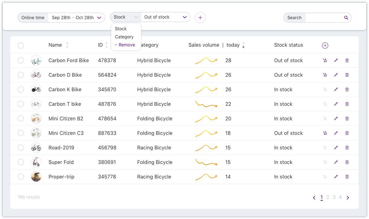
Use filters
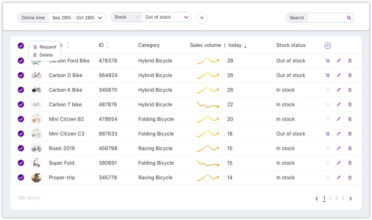
Take an action
TAKEAWAYS
- Don’t try to assign all the interactions into one component, be brave to decouple interactions to simplify them.
- A feature request is not always equal to users’ needs. We need to dig deeper to find the real need.